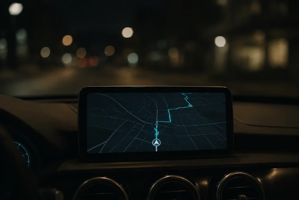
Google is testing a redesigned Google Maps interface in the latest beta version of Android Auto (v17.6.663424), intended to reduce eye strain during nighttime driving. The turquoise direction and turn indicators are being changed to dark gray, while the map background is being switched to a darker theme. The change is visible only on the Android Auto screen, while it is unknown whether this is a planned design update or a temporary beta-related condition.
Why it matters
The change shows that a setting specific to the Android Auto screen, independent of the phone app, is being tested in the in-car navigation experience. The dark color palette is intended to reduce the visual load on drivers from map and direction indicators, particularly during nighttime journeys; for this reason, it is relevant to people who use Android Auto and follow navigation in the dark. However, the fact that the colors are visible only in the beta version leaves open the question of whether this is a permanent user interface preference. Until it becomes clear whether Google will continue the change as a planned design update or remove it later, it is not possible to consider the change an innovation that will be reflected for all users.
Background
Google is not a new name in the FikirPilot archive: we have published 13 news articles mentioning this name in the last 90 days; the most recent is dated September 2, 2026.